

Kindness Made Visible
A quiet return to its roots, Cedele’s strategy-led brand refresh brings its founding intent to the surface again, making space for warmth, humanity and meaning in every bite.
From Familiar to Felt
Founded in 1997, Cedele started as a single artisanal bakery sincerely passionate about using natural ingredients. Since then, they’ve grown into a large chain of over 20 outlets across Singapore serving healthy bakes and meals.
Determinedly focused on growth for the past decade, it was easy for the brand to slowly erode its own brand equity despite its success and unchanged passion. Disconnected from its early artisanal roots, would-be customers perceived the brand as chain-like and impersonal, unaware of its true proposition.
Behind the Breakthrough
SEEN & UNSAID
Insight
Cedele had 79% awareness, but its positioning remained vague. Respondents lumped it in with general eateries offering salads, rather than seeing it as a health-forward brand in its own right.
To address this glaring lack of understanding, we set out to help the brand bring their original promise back into focus—reinstating a spirit of openness, warmth, and small, memorable moments across key touch points in the customer experience.
Redesigning each of these to reflect the brand’s quality ingredients and careful preparation aligned the team’s honest approach and thoughtful intentions with what customers perceive at the store.
BELIEF & MOMENTUM
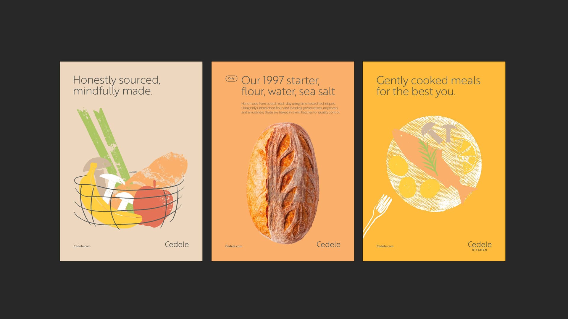
Even after two decades, the heart of Cedele has always been to enable feel-good everyday moments through food. We simplified their brand ethos into their new line “Honestly Sourced, Mindfully Made”—a purposeful statement that stands apart from surface-level healthy claims.

CHARACTER & FORM
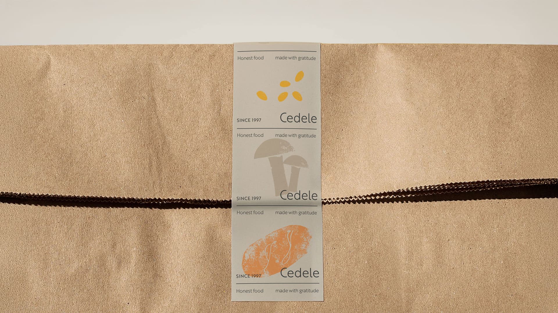
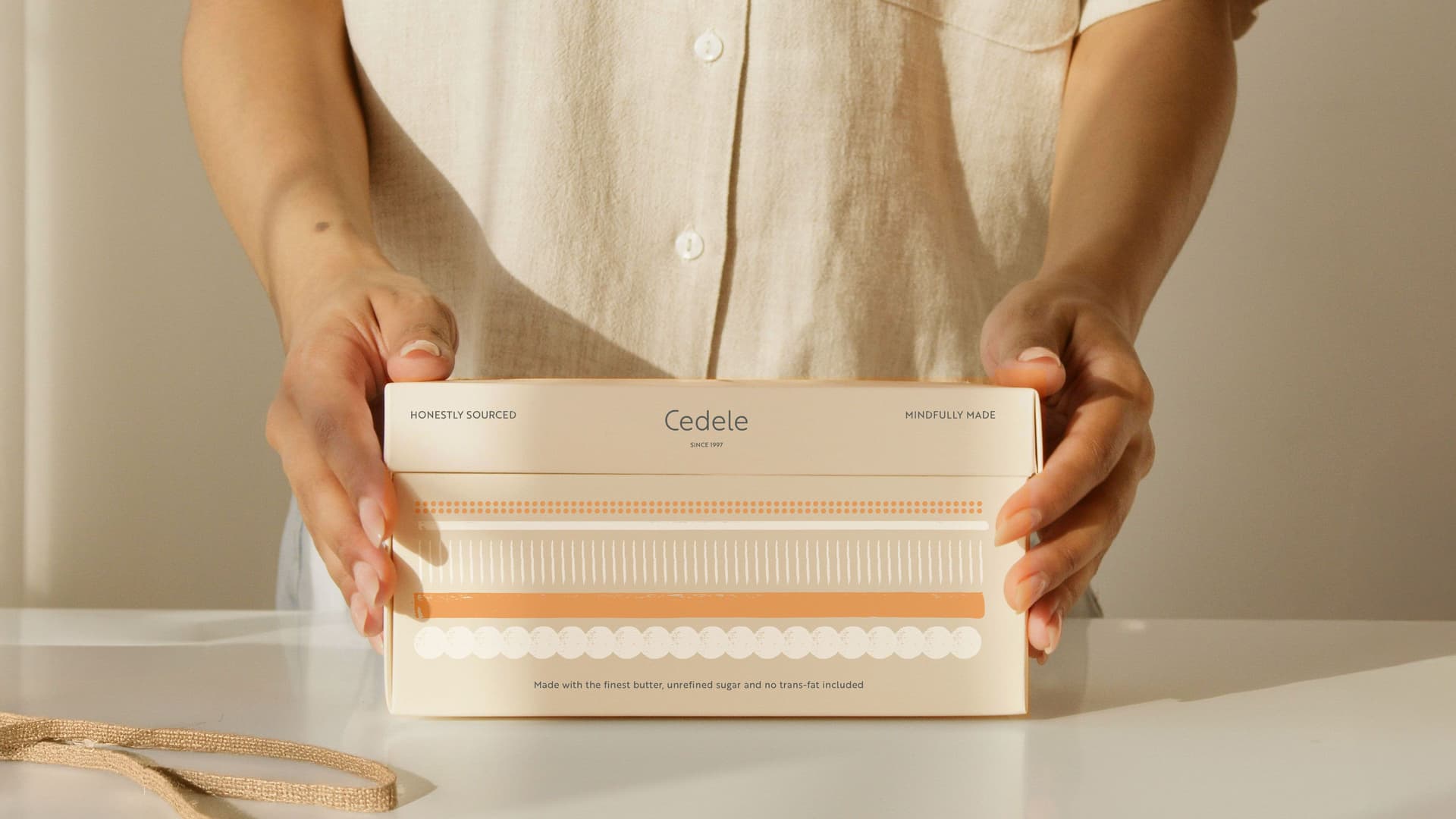
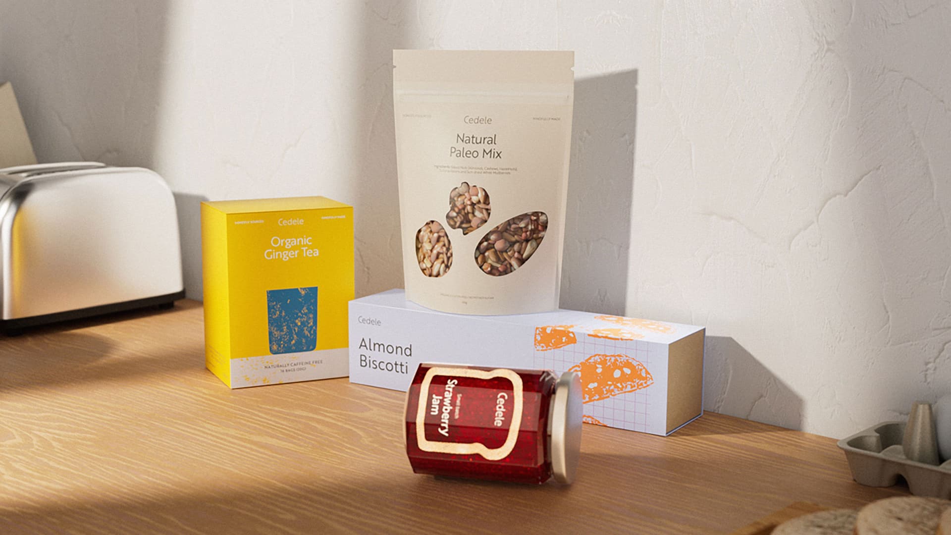
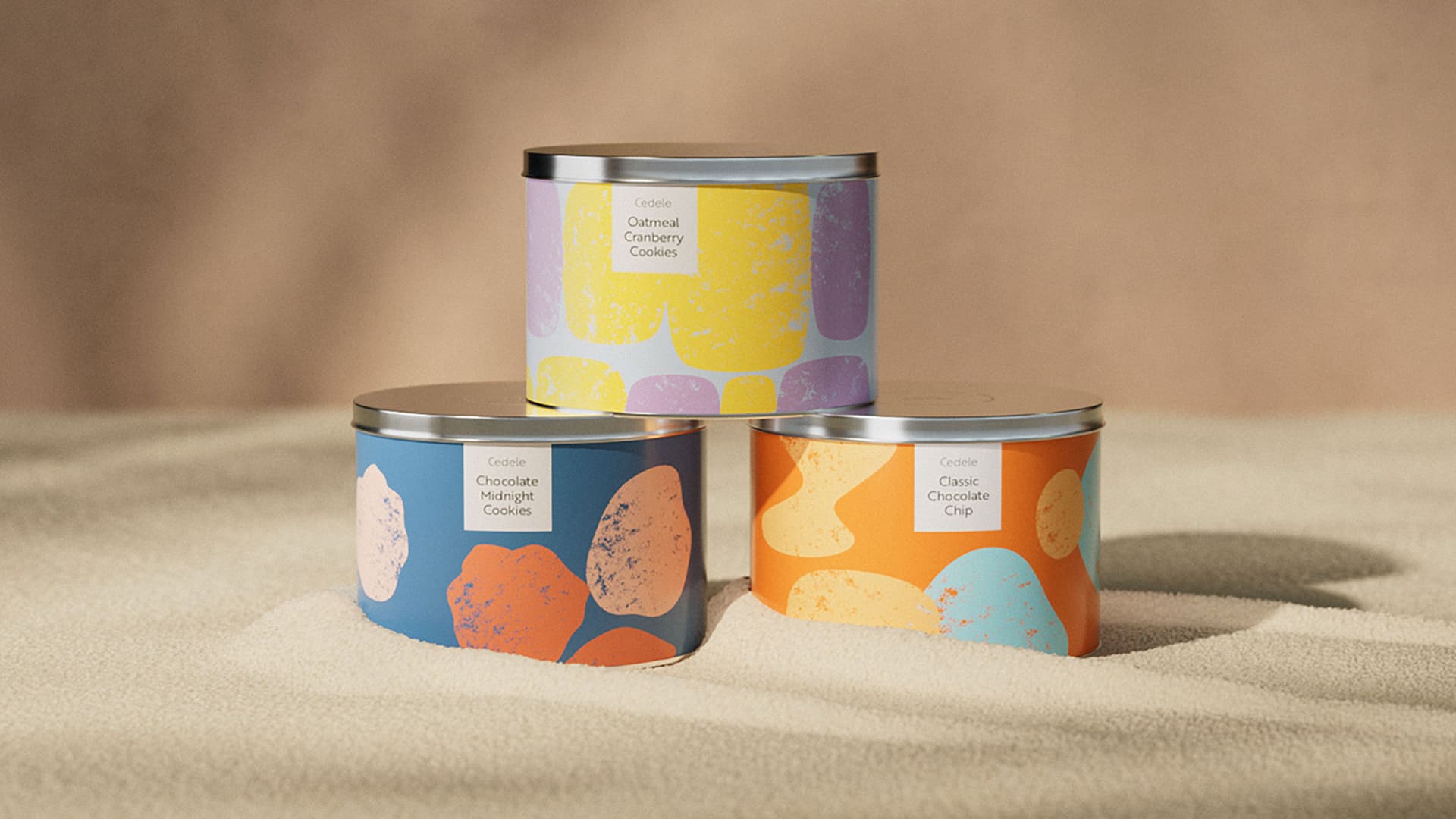
Finally, the brand’s visuals are a reflection of their roots—a simple, no nonsense identity that feels warm and grounded while being consistent and recognisable.
Slight imperfections in the logo and brand typeface softly echo the human hands behind the brand, along with art-directed imagery that supports the brand’s natural and wholesome approach.
A library of illustrations from a previous brand refresh was retained and reinterpreted to create more storytelling moments across touchpoints.
Menu boards were carefully redesigned for ease and legibility, while promotional templates were crafted to highlight key products without compromising on brand equity.

PEOPLE & PLACES
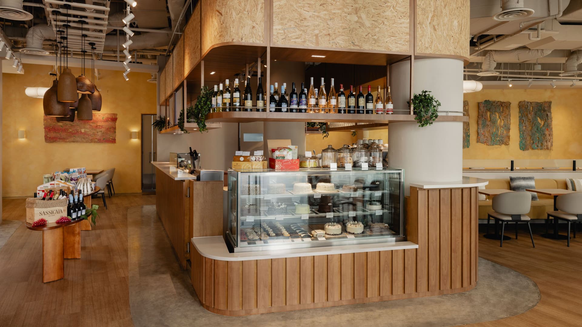
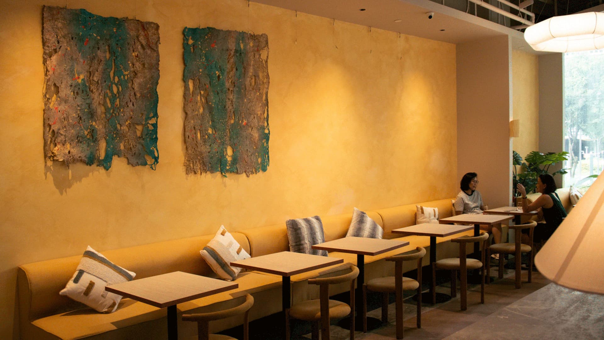
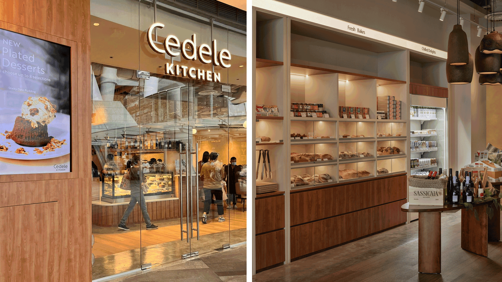
In reimagining the interiors, our friends at LAANK shared the goal of honouring Cedele’s roots: creating a space that embodied the brand’s genuine ethos.
Mixing in natural materials that evoke a sense of warmth and comfort, LAANK’s concepts create the feeling of a much-missed encounter with a familiar friend. More than just a dining experience, customers are invited to linger and embrace the simple joys of life through the space.
Altogether, the new Cedele stores express a return to simplicity and authenticity, amplifying the brand’s renewed purpose as the reliable, thoughtful, bakery café people can turn to anytime.
Outcomes
It’s been an honour to help strengthen a business that cares this deeply about its products and its people. With a renewed brand strategy and toolkit, Team Cedele has been actively rolling out the refreshed identity across every touchpoint, from packaging and e-commerce to CRM and everyday communication.
Since the first updated store launched, customer response has been encouraging. Many are falling in love with the brand all over again.
The founders exited a year after relaunch. We continue to support the new management team in implementing the refreshed brand across the business.