
Aisles Unknown
A question about common goods.
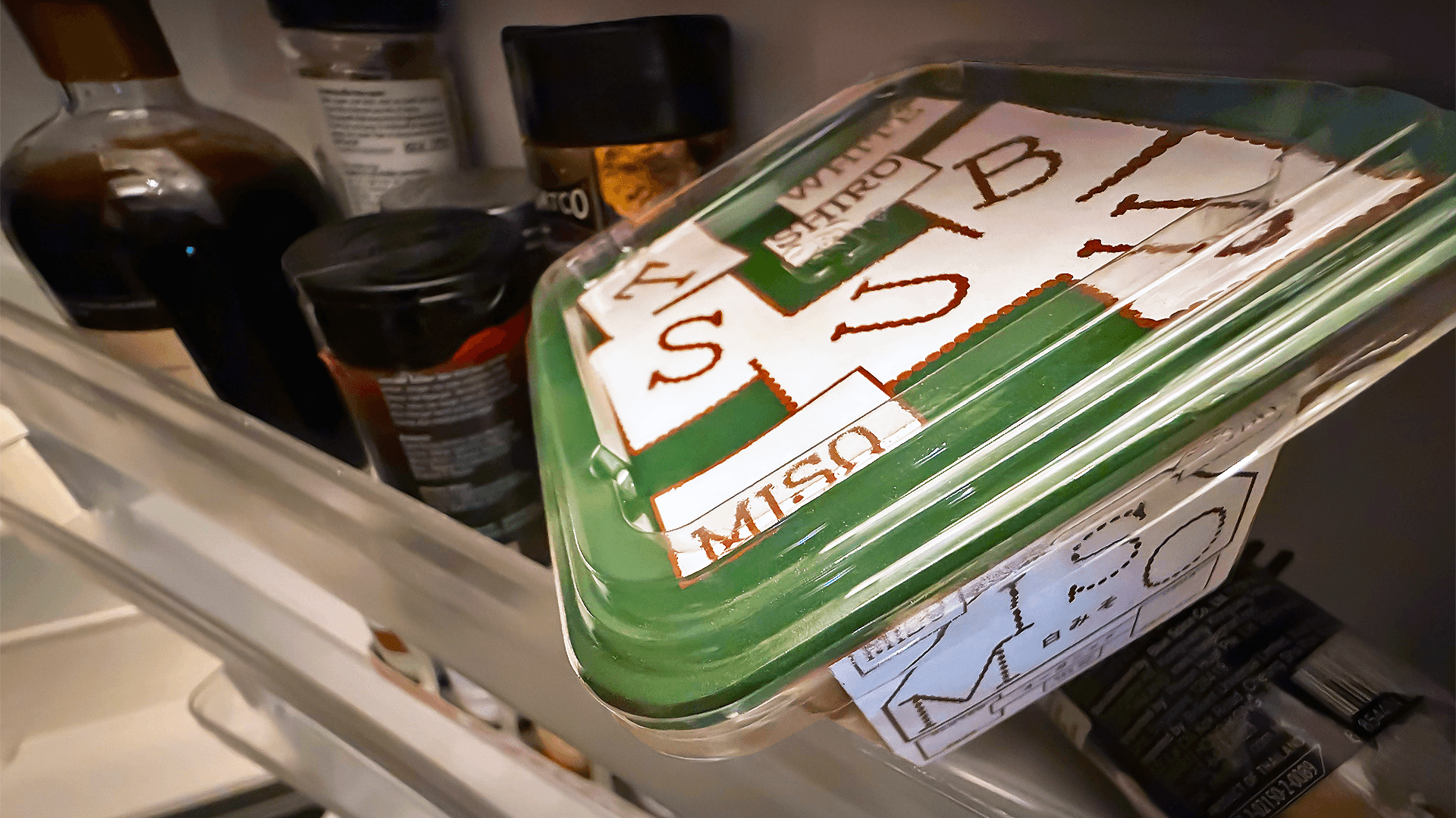
Images of miso soup adorn the miso shelf as if afraid customers still do not know what it is despite miso being an established category; so why not graphical blobs of 'miso' as an expressive take.
The supermarket is a battlefield for attention, where decisions are often made within seconds and with as little thought as possible. Eye-tracking studies on actual supermarket shelves also show a close relationship between visual attention and eventual choice, putting some evidence behind what anyone designing for a supermarket already knows: packaging needs to work hard to be noticed.
There are many best practices around designing packaging, especially for supermarkets, but this particular axiom is peculiarly oxymoronic:
‘premium-looking packaging can improve perceived quality and choice’. Elevate a $10 item to look like it could cost $18 and shoppers might feel like they have found a deal; however, make a $3 item look like it should cost $5 and brand owners would worry that shoppers might assume it is outside of their shopping budget and ignore it completely. So what defines the threshold between cheap, affordable and premium?
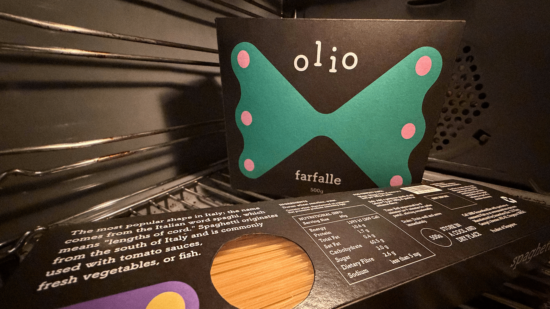
Blue, red, olive, white, Every pasta brand has made a claim on a colour. But why not black?
What Does Cheap Look Like?
Products in supermarket aisles are designed for quick understanding: some products suggest they contain better ingredients while many others shout cheap before you even see the price. For example, Contrasting colours are typically associated with value-for-money products and lower perceived quality, while darker, cooler packaging is often used to signal higher price and elegance. These, however, are by no means universal laws of colour but are actually coded associations we have learned through exposure.
Brands have been working with such codes for decades, so that when a bottle of detergent looks cheap, it is a useful signal for certain shoppers. But it raises a question: how cheap must a thing look simply to appear inexpensive?
We typically associate museums, theatre and the like with places where taste is cultivated, but what if we took a moment to consider the supermarket as an accessible gallery for everyone?
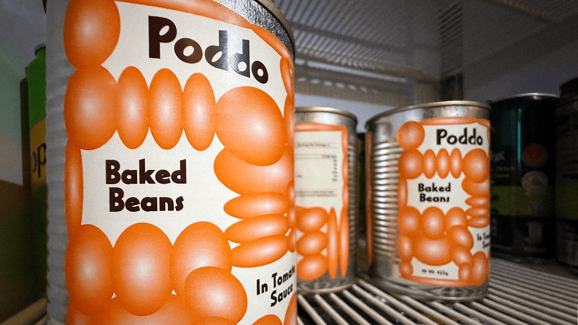
Do we truly still need to see a photo to recognise the product? Here, we turn the entire label into a masthead.
Supermarket shelves contain imagery made up of thousands of little decisions about colour, fonts, language and photography, carefully engineered to attract a particular person and eventually make their way to sit beside the sink, on the pantry shelf, in the fridge, under the bathroom basin and on the dining table of homes everywhere. Seen this way, the supermarket is an enormous exhibition of packaging, where more considered design is often associated with premium positioning while countless inexpensive products rely on the tried and tested codes of looking cheap.
Then again, just because something has less economic value, does it deserve to look mediocre? Is that what the people buying it deserve?
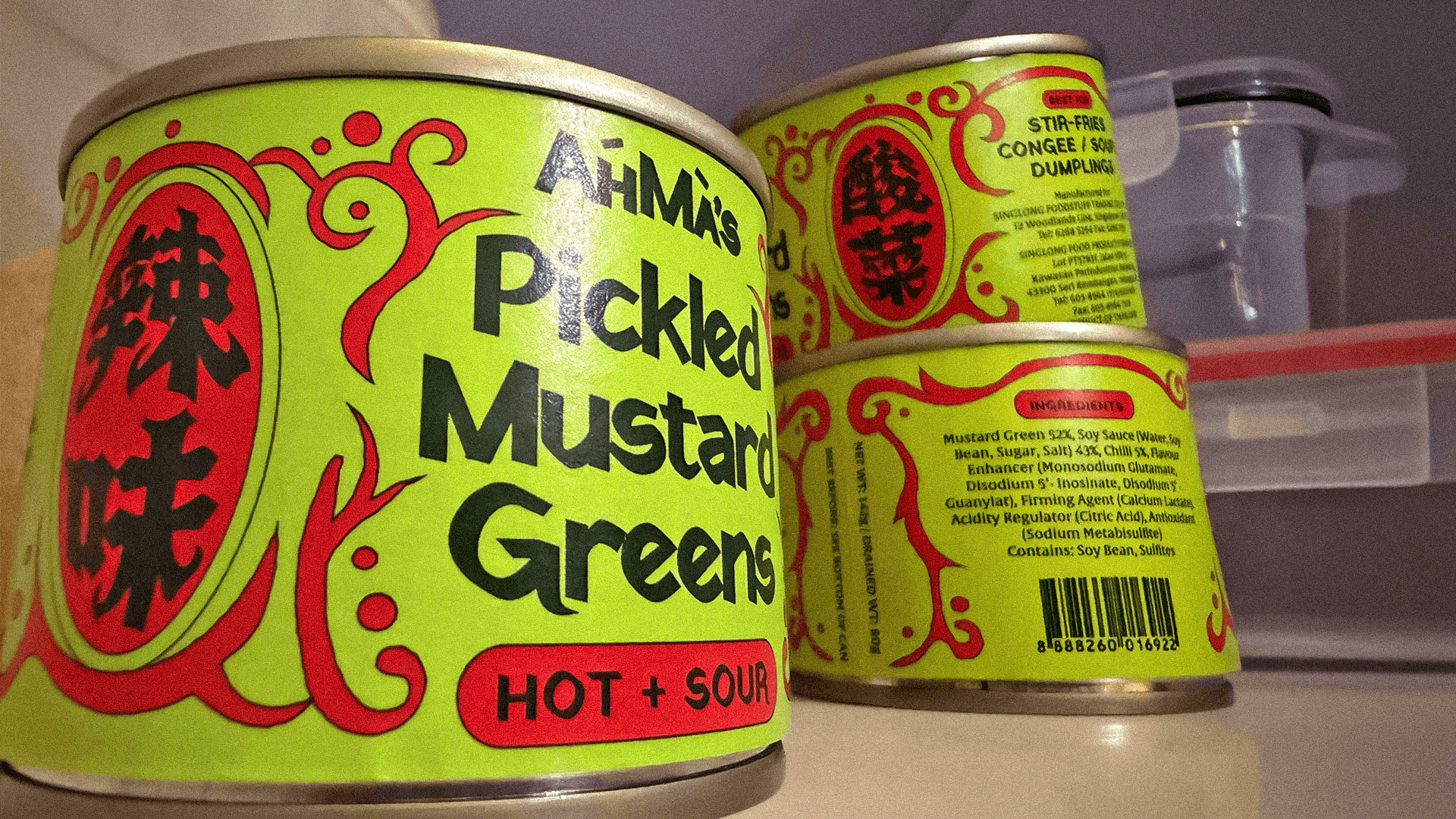
Leaning into tradition but flipping it on its head, this packaging is familiar, yet also not. Even your aunty will do a double take.
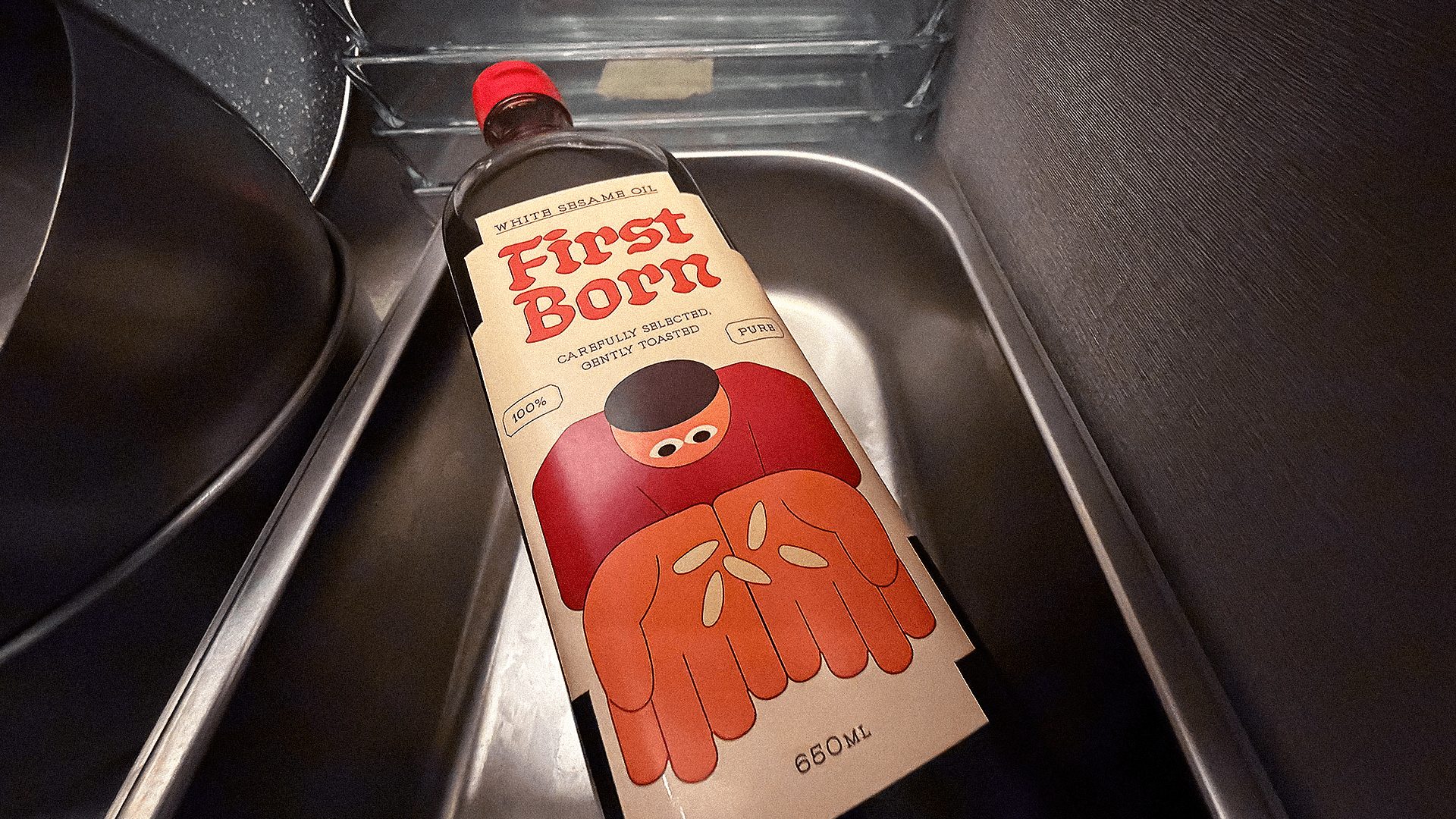
Every sesame oil brand signals "Asian-Quality". We instead do a different step, declaring that only our first-born seeds were sacrificed to make this high quality sesame oil.
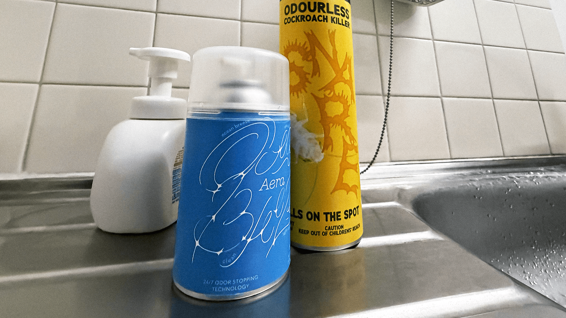
Household goods tend to lean maximal; here, a stripped back approach using softer colours to stand out.
And because inexpensive goods make up so much of people’s everyday, designing them to look cheaper than they need to leaves a big part of our surroundings poorer. When the same, limited visual codes are repeatedly used to communicate affordability, what possibilities are we excluding from the many ordinary things we live with?
Aisles Unknown is not an argument that all packaging should look expensive, no, this is a push back against how narrowly we have come to define what affordability looks like. Just because a product is meant to be inexpensive does not mean it cannot be creatively, thoughtfully designed to satisfy the job it has to do while bringing something more to the everyday.
We are advocating for more imagination within those conventions, rather than allowing the need to appear affordable to be the only objective.
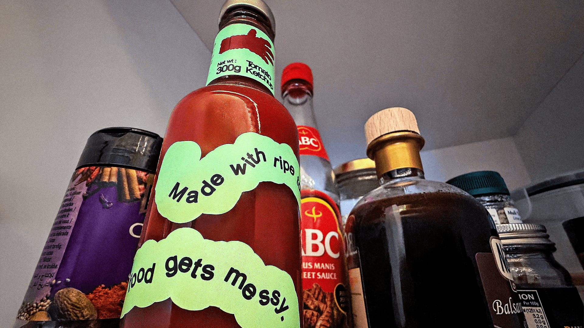
What if a label does not have to be rectangular, instead flows around the bottle like a sauce?
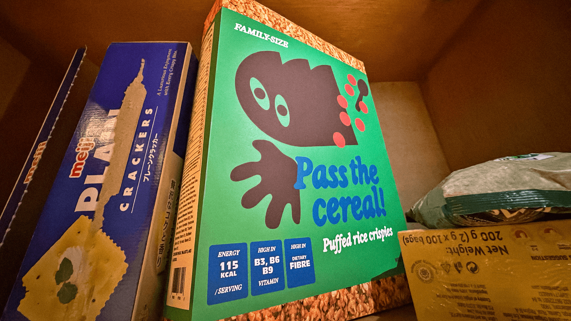
Taking a wholly different approach to creating a mascot for budget cereal.
Better is Better
It’s already well understood that good packaging moves product, and people tend to rush in a supermarket, so rather than focussing only on highlighting a product’s low price, there is also value in finding novel ways for it to distinguish itself from others. As we have sought to exemplify here, when trying to catch anyone shopping on autopilot, designing against category conventions is one way to become distinctive.
Once we consider the role packaging plays in our lives and homes, better designed packaging makes living with it that bit richer for everyone, especially for the common goods we hardly think about at all.

Expressive designs inspired by the products' functionality amidst an array of brightly coloured bottles.