OATBEDIENT
SIMPLE BY CHOICE, LOVED BY DESIGN
The start-up behind Oatbedient had a clear goal: to create clean, plant-based products that people actually want to drink—starting with oat milk. No fillers and no weird aftertaste. Just good ingredients, good taste, and a good heart.
The product delivered (we taste-tested it ourselves). But the brand? Not yet. In a saturated market full of loud, hyper-styled competitors, Oatbedient needed to stand out—not by shouting, but by being clear, calm, and genuinely trustworthy.
This was the tension: can a brand feel everyday, be universally appealing yet does not disappear into mainstream noise?
Our Work
From the start, we knew this brand wouldn’t be built on hype. Oatbedient had to feel like a brand you’d trust with your kid’s breakfast—or your parents’ pantry. That meant leading with heart. We worked closely with the founders to translate their values into a brand strategy that would deliver with honesty.
BRAND STRATEGY & MESSAGING:
Rooted in simplicity, transparency, and that rare thing in FMCG: sincerity
BRAND VOICE:
Conversational, clean, and deeply human
VISUAL IDENTITY:
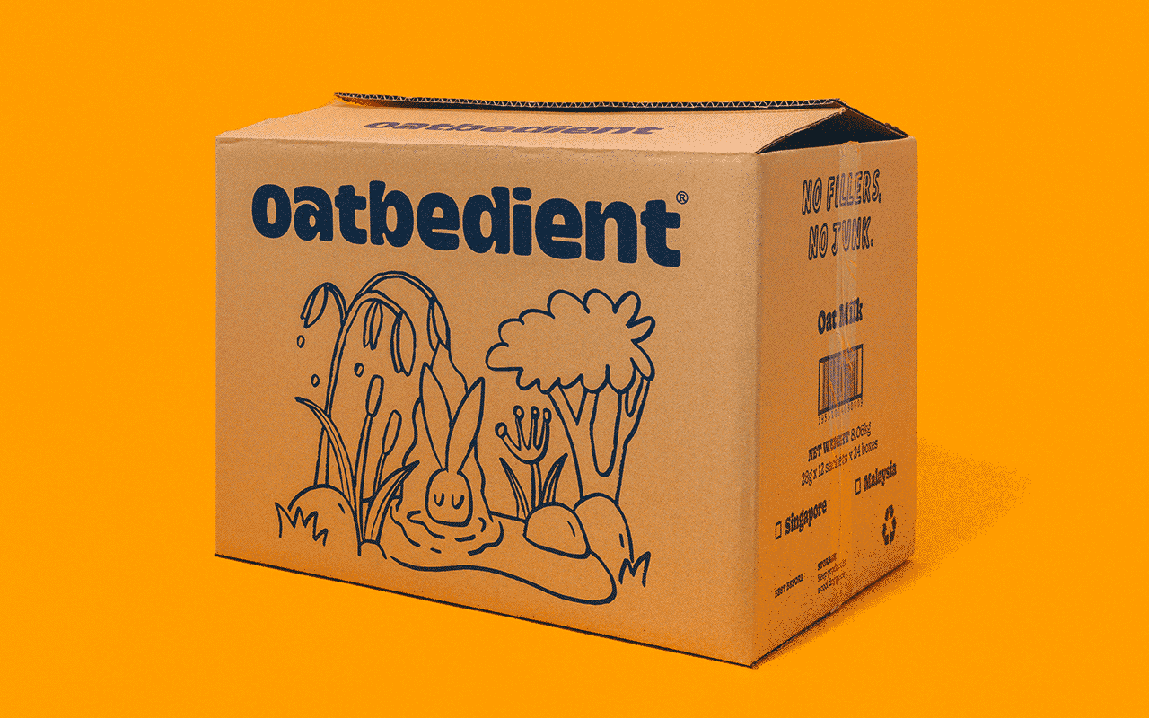
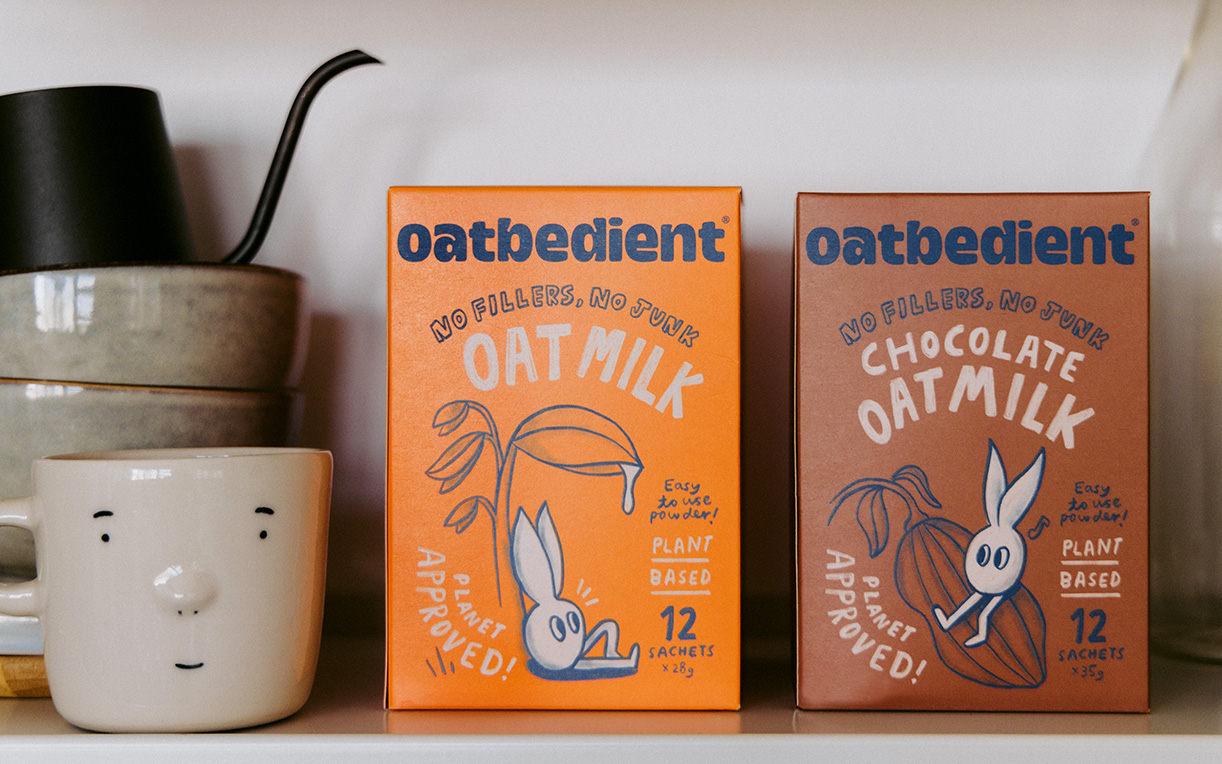
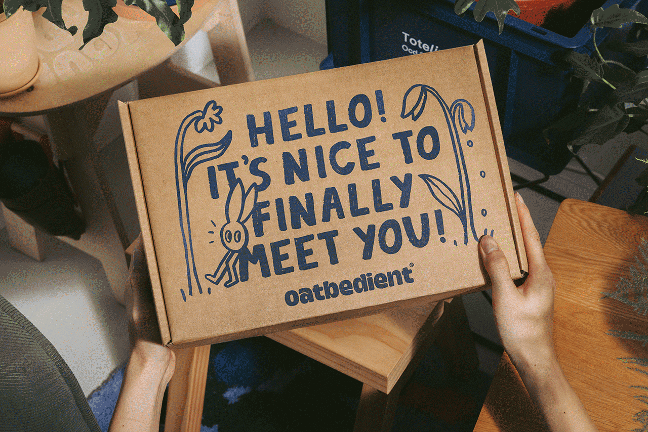
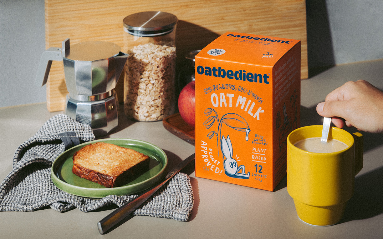
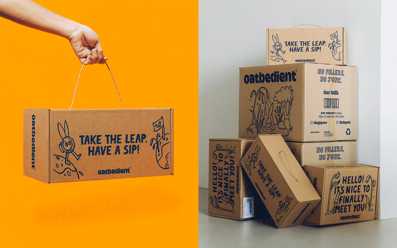
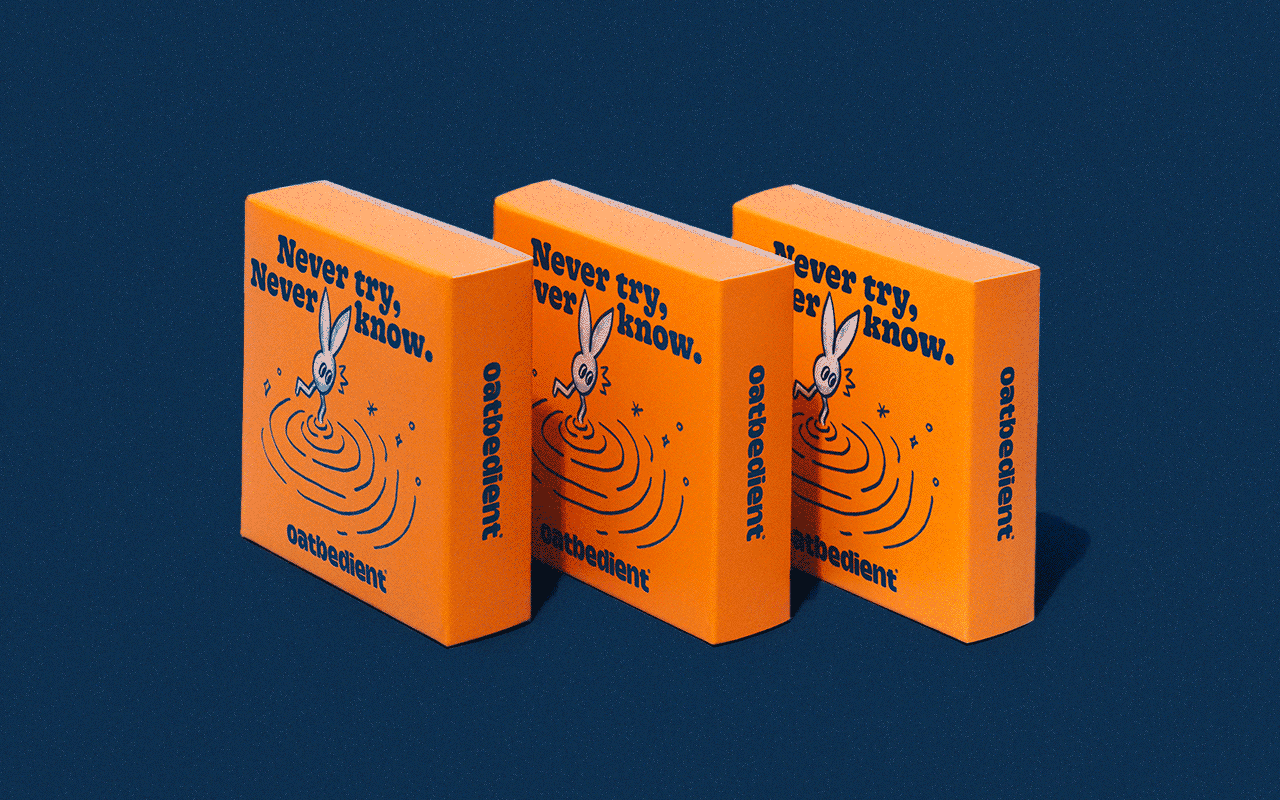
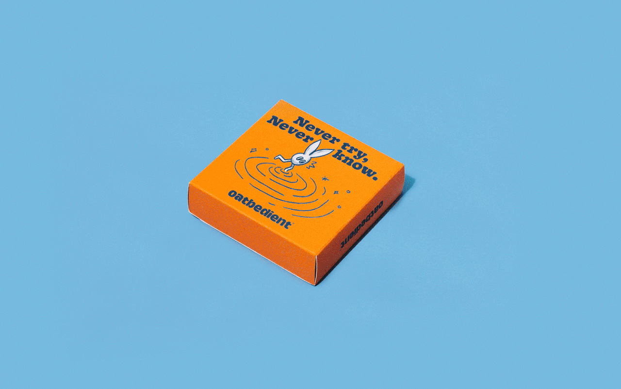
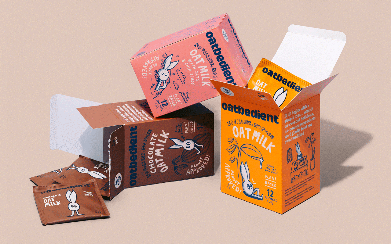
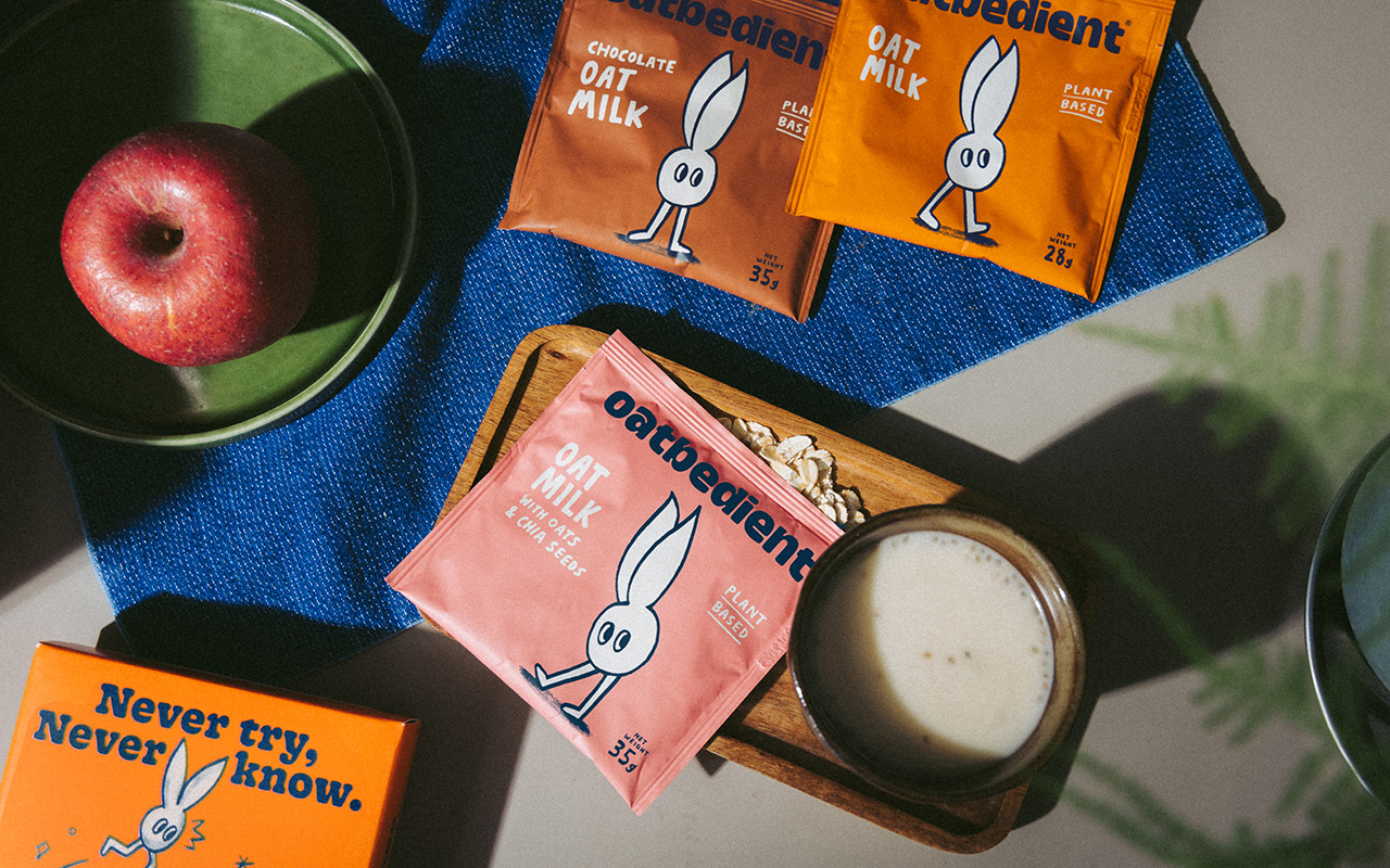
Creation of a wide-eyed oat mascot, “Oatdit,” whose world is humble, warm, and just a little playful
PACKAGING SYSTEM:
Designed for both emotional resonance and shelf clarity
BRAND STRATEGY & MESSAGING:
Rooted in simplicity, transparency, and that rare thing in FMCG: sincerity
BRAND VOICE:
Conversational, clean, and deeply human
VISUAL IDENTITY:
Creation of a wide-eyed oat mascot, “Oatdit,” whose world is humble, warm, and just a little playful
PACKAGING SYSTEM:
Designed for both emotional resonance and shelf clarity
Forming the Brand
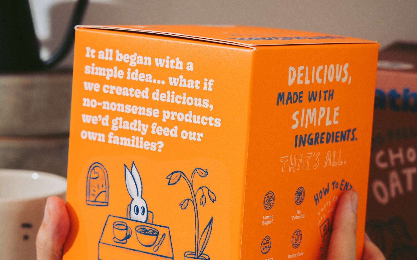
We started with tone. Early iterations leaned bolder and louder—that wasn’t Oatbedient. So we stripped it back to the truth: this was a brand with nothing to hide and no fillers.
The final tone of voice is straightforward and kind—reflecting the founders’ desire to communicate with real people, not market segments. Every line was crafted to feel like it came from a real aunty, not a boardroom.
We created a brand world that echoed this. The hand-drawn typeface has a chalky texture—imperfect and warm. The illustrated oat character anchors the brand in personability, inviting even skeptical shoppers to take a closer look.
Across every collateral, we prioritised delightful clarity: a brand that never talks down, never tries too hard, and never forgets that everyday people deserve better.
“Somewhere Else understands our needs and does all it can to achieve the best outcome for us. The team is also willing to work such that both consultant and client ambitions converge for success. Their strong concepts ideas make them highly recommended!”
Alex Seh, Business Development
Alex Seh, Business Development
OUTCOMES
Oatbedient launched with a visual and verbal identity that breaks category clichés—relatable enough for grocery aisles, but strong enough to scale.
The brand now stands out as a thoughtful alternative in a noisy FMCG space—showing up from across the region, from Taiwan to Mongolia.
We continued to design packaging for new ranges post initial launch.
Founders have run with the extensive toolkit provided; enabled creative brand building uncommon in the FMCG space. They also collaborated with Uniqlo T and presented at streetwear conventions.
Most importantly, Oatbedient now feels like what it always wanted to be: a better everyday choice, designed for real people and real lives.